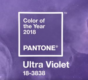
Pantone announced recently its color of the year for 2018 – and it’s Ultra fun! The color, Ultra-Violet 18-3838, is another bold choice for Pantone©, following 2017’s “Greenery” choice.
A modern purple with a strong blue base, it’s full of mystery and creative expression. An intriguing mix of warm reds and cool blues, it’s contradictory nature is intriguing. Purple hues have long been considered mystical, often loved by those who push the boundaries of originality.
It “communicates originality, ingenuity, and visionary thinking,” explains Leatrice Eiseman, executive director at the Pantone Color Institute. So, why Ultra Violet? With the state of our world, Pantone listed several reasons for their selection, including is ability to energize, refresh and heal, (think amethyst crystals), and inspire creativity and originality. “It’s truly a reflection of what’s needed in our world today,” explained Laurie Pressman, Vice President of Pantone.
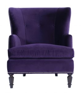
So Ultra Violet in design? It’s not something we’ve seen much as we watch deliveries go out daily, although every now and then we’ll see a pop of this hue. It’s not likely that we’ll see it much in large doses in interiors, but you never know – wouldn’t a tufted sofa in a purple velvet make a statement? We do know that pops of it are fun and inspirational, whether it with an accent chair, rug, or accessories. Let the color pop against grey or neutral tones, or rock it out with other bold tones of red, blue, and yellow.
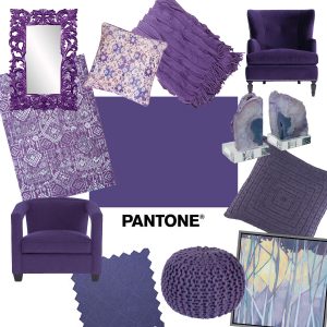
How do you Ultra Violet?
However it is used, be creative, or let a Smithe designer show you how to best introduce into your home!
What do you think of this color? Tell us in the comments!